
How to Introduce Colour to Your Minimalist Wedding Stationery
Minimalist wedding stationery is known for its clean lines, elegant typography, and understated charm. But that doesn’t mean it has to be completely devoid of colour. A thoughtful splash of colour can add personality, warmth, and a unique touch while still maintaining a refined aesthetic. Here’s how you can introduce colour to your minimalist wedding stationery in a way that feels sophisticated and intentional.

1. Soft, Neutral Tones
If you love the idea of colour but want to keep things subtle, opt for soft, muted tones like blush, sage green, taupe, or powder blue. These gentle hues add warmth without overwhelming the minimalist look. Consider incorporating them into the background, borders, or as a delicate wash of colour behind your text.

2. Bold Accents
For those who prefer a more striking contrast, use a bold accent colour sparingly. Deep navy, emerald green, terracotta, or burgundy can create a refined statement without taking over the design. A coloured envelope liner, wax seal, or ribbon can add just the right amount of vibrancy while keeping the main stationery clean and simple.

3. Coloured Typography
Who says text has to be black? Using coloured typography is an elegant way to introduce a subtle hint of colour. Darker shades like charcoal, deep blue, or earthy tones maintain readability while adding a touch of personality. For a softer effect, consider warm greys or muted pastels.

4. Watercolour Washes & Minimalist Illustrations
A delicate watercolour background or a minimalist hand-drawn illustration can infuse colour in an understated way. Think of soft ombré washes, delicate florals, or abstract strokes that add a gentle artistic touch without overwhelming the minimalist design.

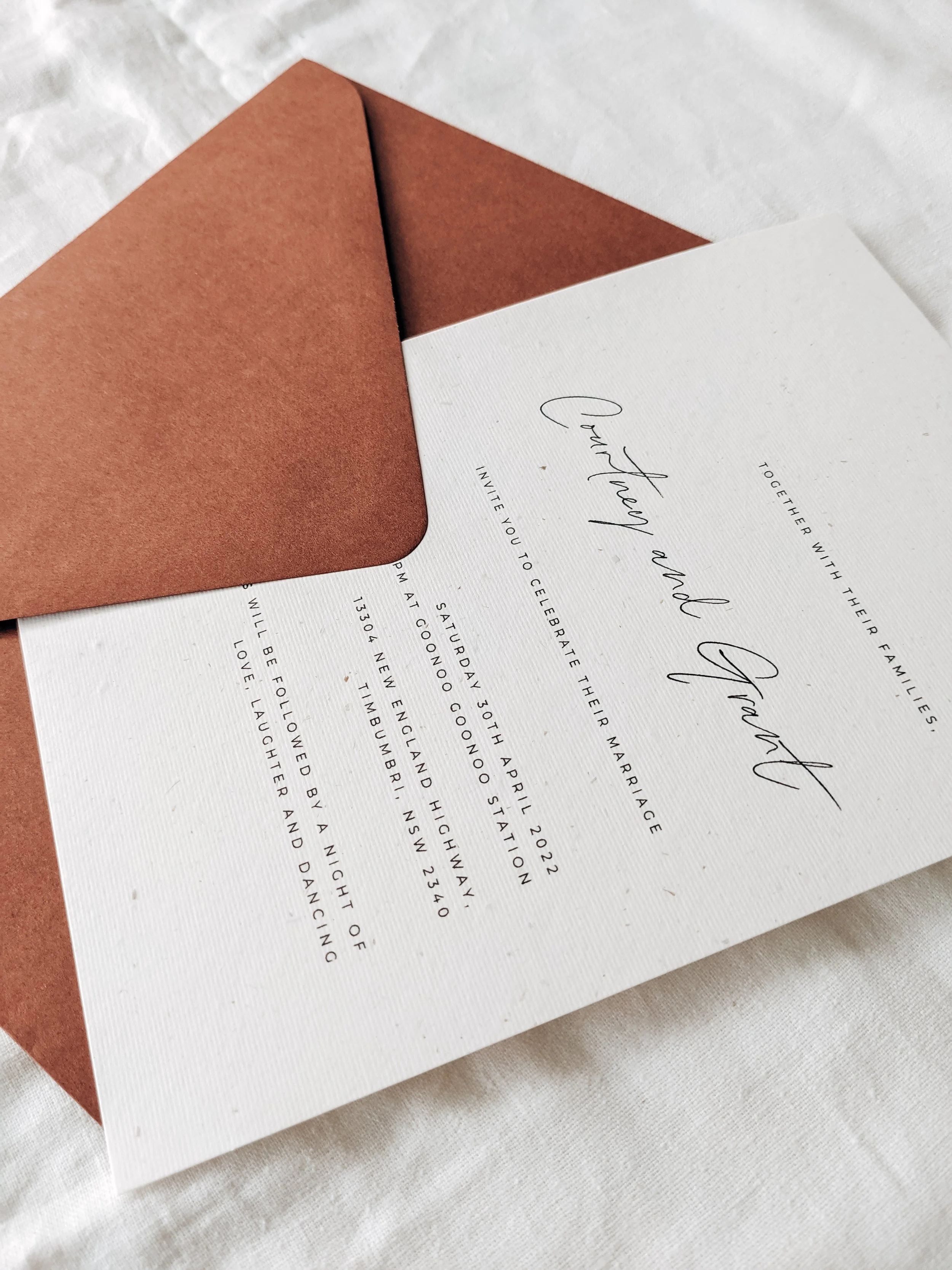
5. Coloured Envelopes & Envelope Liners
If you want to keep the invitation itself minimal, coloured envelopes or envelope liners are a great way to introduce colour. A deep jewel-toned envelope or a liner with a soft floral print can create an element of surprise and sophistication when your guests open their invitations.
6. Foil & Metallic Accents
Gold, rose gold, or copper foil can add warmth and elegance while still keeping things minimalist. Whether used for text, borders, or delicate line details, metallics add a refined and luxurious feel without being overpowering.

7. Textured or Handmade Paper in Natural Tones
Coloured handmade or textured paper, such as soft blush, muted grey, or warm beige, can introduce colour without relying on ink or illustrations. This method adds depth and a tactile element to your stationery while keeping it effortlessly chic.

8. Minimalist Colour Blocking
For a modern, structured look, consider colour blocking with a two-tone design. A simple white invitation with a coloured border, or a half-and-half design with a neutral shade and a muted pastel, can add contemporary elegance while keeping the aesthetic sleek.
Final Thoughts
Introducing colour to your minimalist wedding stationery doesn’t mean sacrificing simplicity. Whether through subtle pastel washes, rich envelope liners, or carefully chosen typography, a well-placed pop of colour can enhance your design while maintaining an elegant, understated feel. The key is balance—let colour complement, not overpower, your minimalist aesthetic.

Would you like recommendations on specific colour palettes for different wedding themes? Visit our website for colour and finishes options.